


Medicore
Product DesignHealthcare ResearchMedicore
- UI DESIGN
- UX & USER FLOWS
- PRODUCT DESIGN
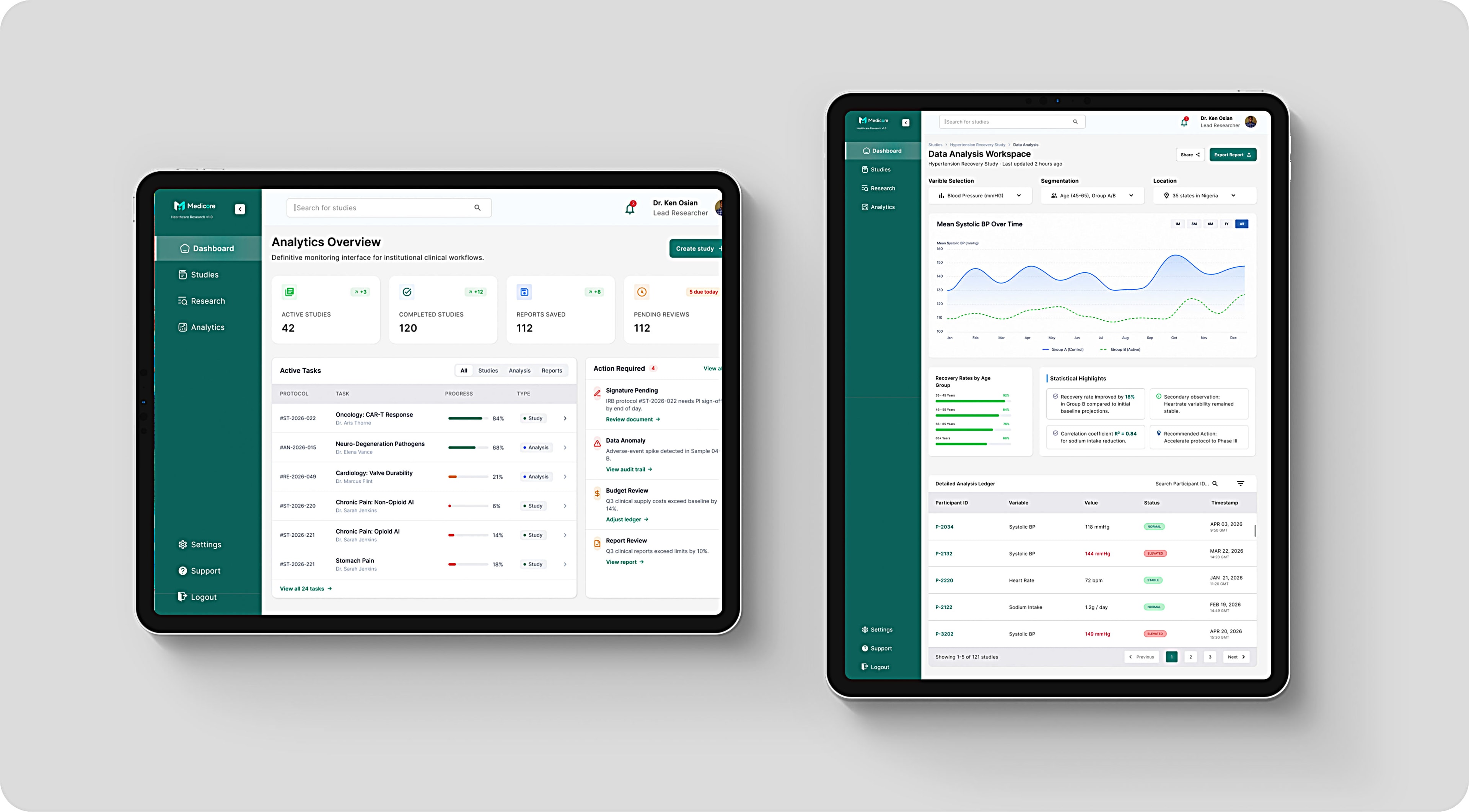
Medicore is a web-based healthcare research management platform that streamlines the planning, execution, analysis, and reporting of clinical studies. It provides researchers with a centralized workspace to manage study progress, participant data, research insights, and reporting without relying on fragmented tools or manual workflows.
- Role
Product Designer
- Scope
- UX ResearchUX DesignUI DesignProduct StrategyInformation ArchitectureDesign SystemInteraction Design
- Problem
Clinical research often relies on disconnected tools, making it difficult to manage studies, collaborate with teams, and keep track of research progress. This fragmented workflow increases administrative effort and slows decision-making.
- Solution
Medicore brings the entire clinical research workflow into one centralized platform. Researchers can create and manage studies, monitor progress, analyze collected data, and generate reports without leaving the application.
Scope & Delivery
6
product areas designed end to end
Full lifecycle
planning through to reporting
The design transforms clinical research management into a more structured and intuitive experience. By centralizing study creation, participant management, data analysis, and reporting within a single platform, Medicore is structured to reduce fragmented workflows, giving researchers a clearer, more efficient way to manage their work from beginning to end.
The Goal
The goal of Medicore was to simplify the complexity of clinical research by creating a centralized platform that supports every stage of the research lifecycle.
I wanted to reduce the reliance on disconnected tools, improve visibility into study progress, and make it easier for researchers to manage participants, analyze data, and generate reports from a single workspace.
Ultimately, the objective was to help research teams spend less time managing processes and more time producing meaningful, data-driven outcomes.


Design Strategy
My approach to designing Medicore was centered on simplifying complex research workflows without sacrificing the depth researchers need. Rather than focusing solely on the interface, I designed the experience around how researchers naturally move through the lifecycle of a study, from planning and participant management to data analysis and reporting.
I prioritized a clear information hierarchy to ensure users could quickly understand the status of their studies and access the information they needed with minimal effort.
Product Architecture
Medicore follows a structured workflow that mirrors the lifecycle of a clinical research study.
- 1
Dashboard
The entry point, surfacing active studies, recent activity and anything waiting on the researcher.
- 2
Studies
The central library, where every project can be searched, filtered and opened.
- 3
Create New Study
A sectioned setup flow that captures objectives, participants and timelines before a study goes live.
- 4
Study Details
The record for a single study, and the point the rest of the workflow branches from.
- 5
Data Analysis
An interactive workspace for exploring trends, comparing variables and reading collected results.
- 6
Research Report
The closing stage, where findings are reviewed, exported and shared without leaving the platform.
This architecture ensures that every action naturally leads to the next stage of the research process while maintaining context throughout the experience.
Key Design Decisions
Designing Around Workflows
Rather than treating each screen as an independent feature, I designed Medicore around the complete research lifecycle. This creates a natural progression between tasks and reduces unnecessary navigation throughout the platform.
Prioritizing Information Hierarchy
Research generates large volumes of information, so I focused on surfacing the most critical data first while progressively revealing secondary content. This makes complex interfaces easier to scan and reduces cognitive overload.
Creating Consistency at Scale
Reusable components, standardized layouts, and familiar interaction patterns establish consistency across the platform, making it easier for users to learn the product and navigate between different sections.
Making Data Easier to Understand
Since research decisions rely heavily on data, charts, tables, and metrics were designed to emphasize clarity over decoration. Every visualization supports faster interpretation without distracting from the information itself.
Dashboard
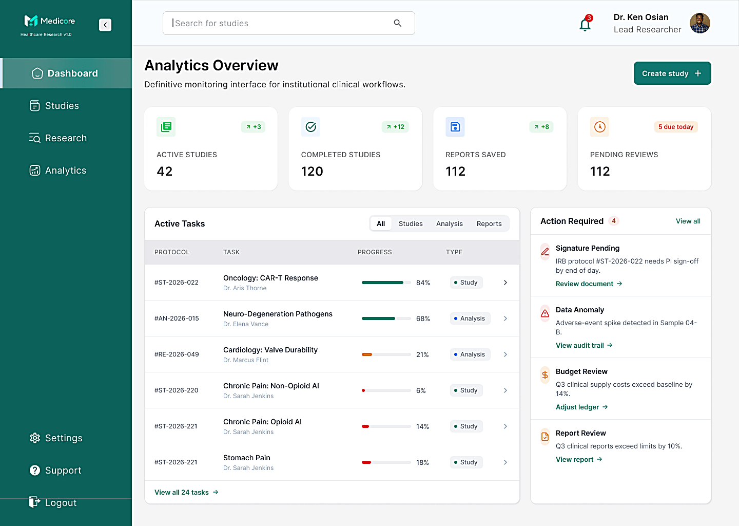
The dashboard serves as the research command center, giving users an immediate overview of all active studies, their current status, and areas that require attention. Instead of overwhelming users with data, the interface prioritizes high-level metrics and recent activity, allowing researchers to understand the state of their work within seconds.
Studies
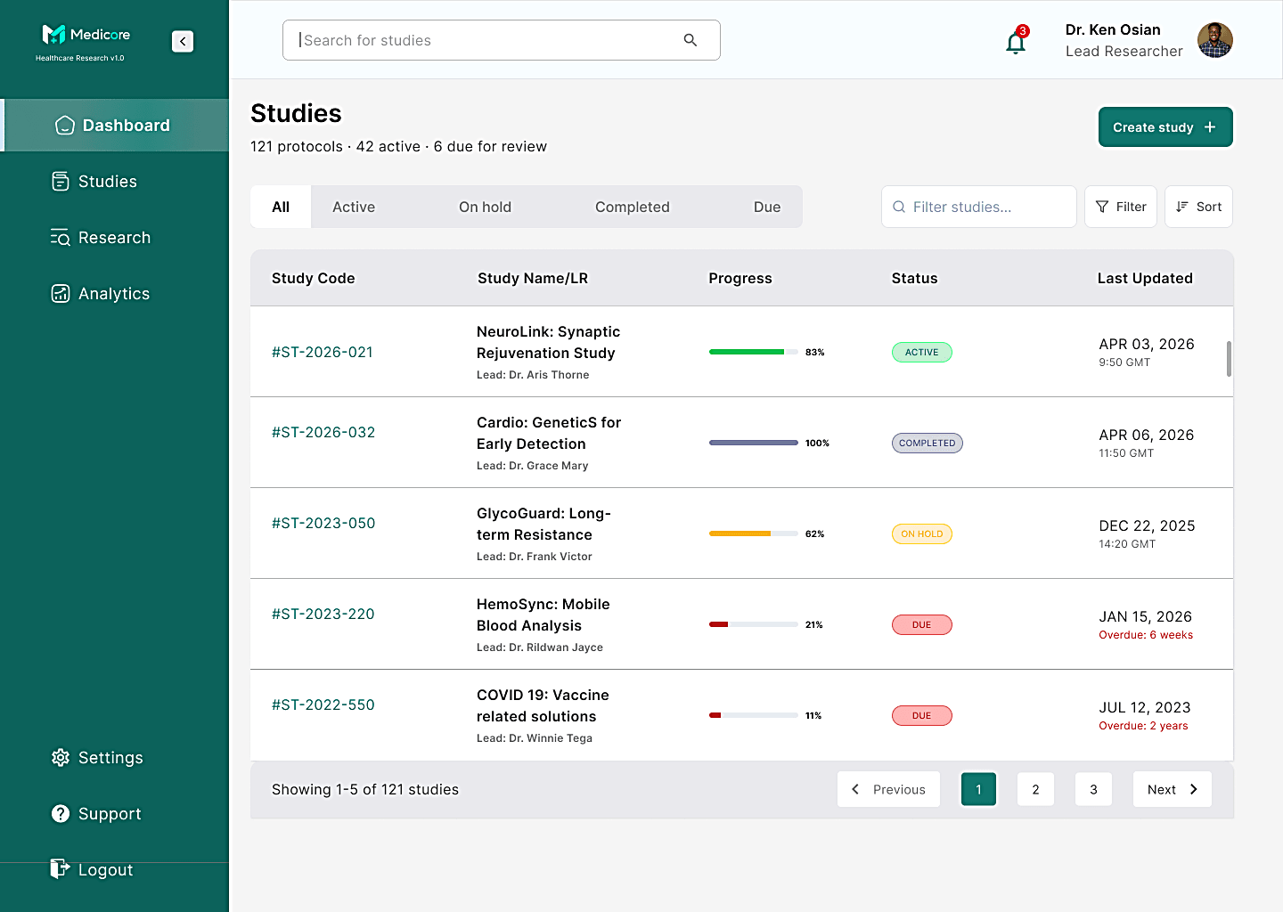
The Studies page acts as the central workspace for managing research projects. Researchers can browse every study, search by keywords, filter by status or date, and quickly access detailed information through a structured data table. Color-coded status indicators and clear row actions make it easy to monitor multiple studies without losing context.
Create New Study
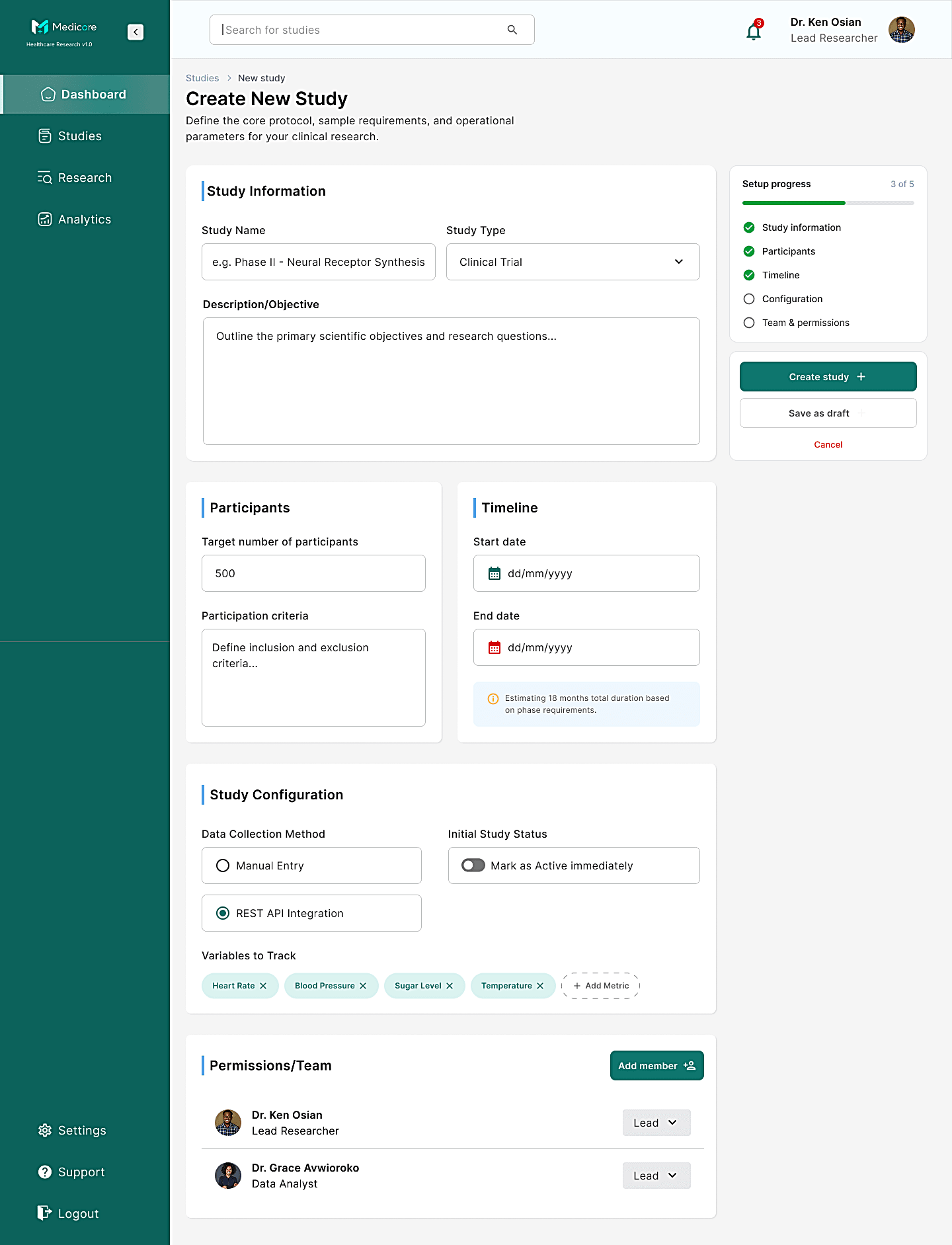
Creating a research study involves multiple decisions, from defining objectives to configuring participants and timelines. Rather than presenting everything in one long form, the experience is divided into logical sections that reduce cognitive load while ensuring all essential information is captured before a study is launched.
Data Analysis
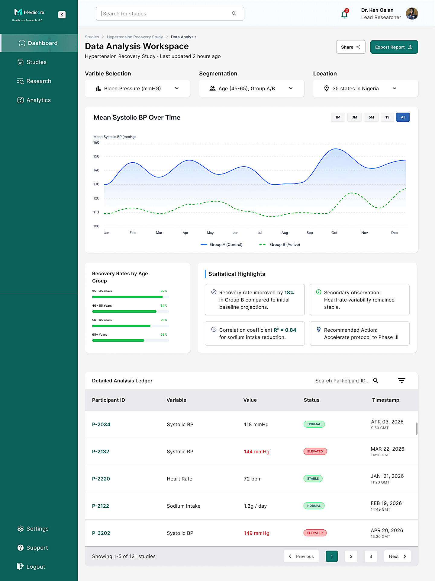
The Data Analysis workspace transforms raw research data into meaningful insights through interactive charts, filters, and visual summaries. Researchers can explore trends, compare variables, and identify patterns more efficiently, making it easier to interpret findings and support informed decision-making.
Research Report
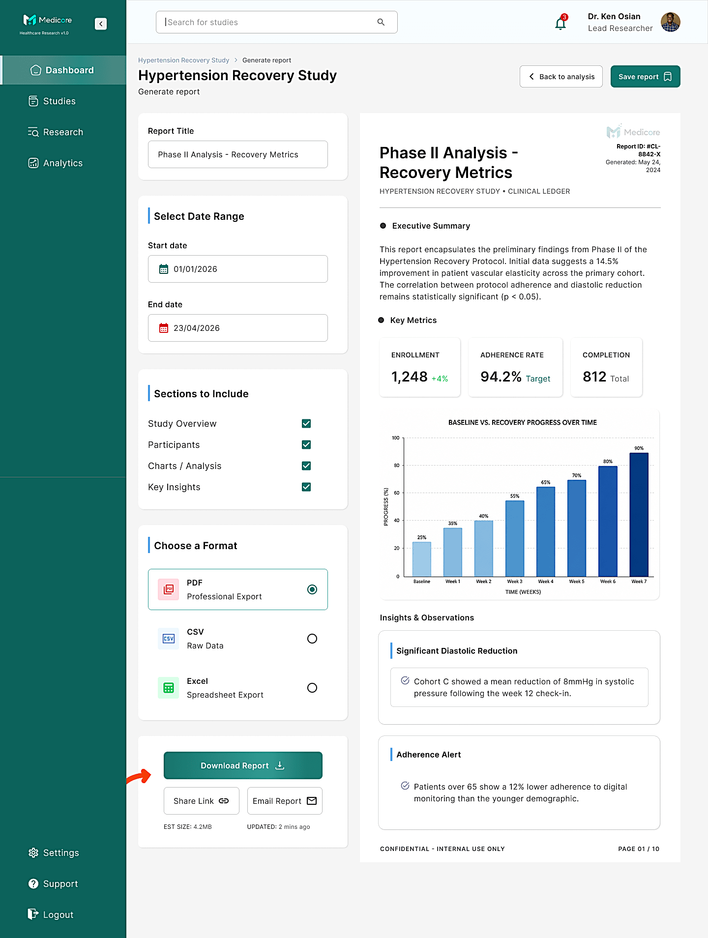
The final stage of the workflow enables researchers to review study outcomes and generate professional reports. Instead of manually compiling findings, users can preview their results, choose an export format, and share research outputs directly from the platform, creating a seamless transition from analysis to reporting.
Key Takeaways
Designing Medicore made it clear that a research platform is a workflow problem before it is an interface problem. The screens only started to hold together once I stopped treating them as separate features and laid them out along the path a study actually travels, from planning through to the report at the end.
Density was the constant tension. Clinical research produces far more information than any one screen can carry, so most of the work went into deciding what earns the top of a page and what can wait behind a filter, a row action or a second view. Hierarchy did more for legibility here than any styling choice.
The other lesson was restraint in the data views. Charts and tables are where a researcher makes decisions, so every one of them had to be judged on how quickly it could be read rather than how it looked, and the plainest version was usually the right one.