


RocketDevs Competitor Pages
- SEO DESIGN
- CONVERSION-FOCUSED
- UX DESIGN
RocketDevs wanted to capture high-intent traffic from users comparing developer hiring platforms. Rather than creating generic comparison pages, I designed dedicated landing pages that clearly positioned RocketDevs against individual competitors while helping users make informed hiring decisions.
- Role
Product Designer
- Scope
- UX ResearchUX DesignUI DesignDesign SystemInformation ArchitectureResponsive Web DesignConversion Optimization
- Problem
Users searching for comparisons such as "RocketDevs vs Toptal" or "RocketDevs vs Turing" often arrive with a specific hiring decision already in mind. Existing comparison pages were text-heavy, and did little to guide users toward taking action.
- Solution
We designed a scalable competitor page framework that presents key comparisons in a clear, easy-to-scan format. By combining structured content, side-by-side comparisons, trust signals, and strategic calls to action, the pages help users evaluate their options confidently while guiding them toward hiring through RocketDevs.
The Goal
The goal of this project was to design a scalable framework for RocketDevs' competitor pages that supports both SEO and conversion goals. Instead of creating unique layouts for every competitor, we developed a reusable structure that could be adapted across multiple pages while maintaining a consistent user experience.
The pages were designed to simplify complex comparisons, build trust through transparent information and social proof, and help users confidently choose the right hiring platform.


Design Strategy
My design strategy centered on making complex comparisons easy to understand and act on. Since users arriving on these pages were already evaluating different hiring platforms, I prioritized clarity, scannability, and trust over lengthy marketing copy.
I structured each page into logical sections that answer the questions users are most likely to have during their decision-making process, using comparison tables, visual hierarchy, trust signals, testimonials, and clear calls to action. To ensure consistency and scalability, I designed a reusable page framework that could be adapted across multiple competitor pages.
Key Sections
Here's a break down of individual sections I worked on:
Hero Section
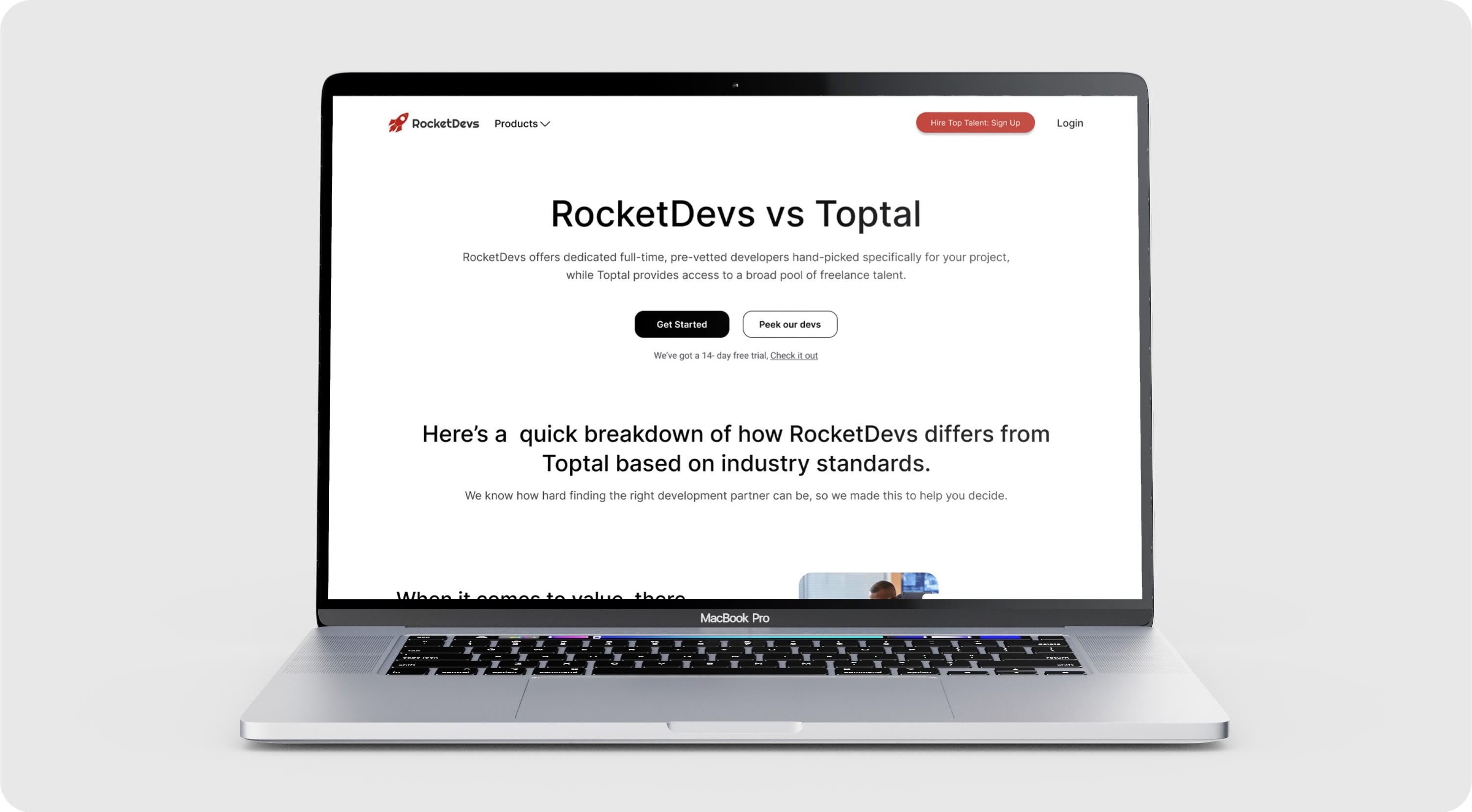
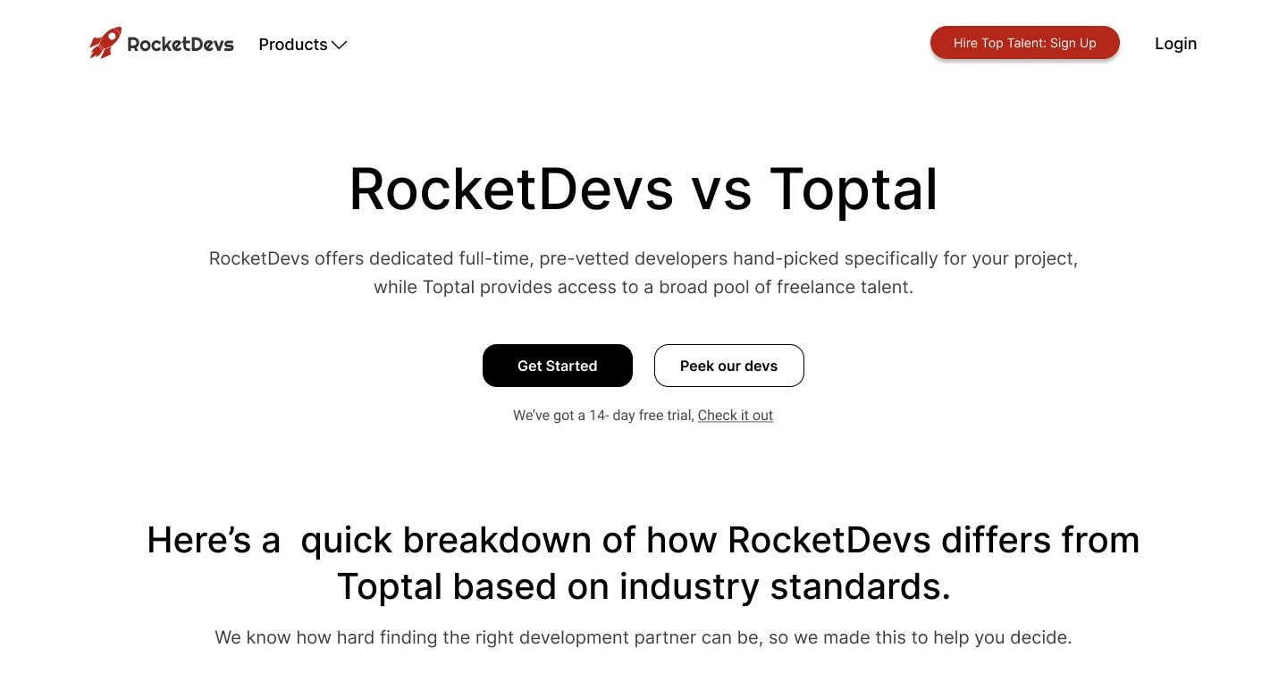
The Hero section was designed to immediately establish the comparison while reassuring users that they had landed on the right page. Instead of relying on generic marketing headlines, I used clear messaging that identified the two platforms being compared and communicated RocketDevs' value proposition from the very first screen.
To encourage users to continue exploring, I paired the headline with concise supporting copy, prominent call-to-action buttons, and visual trust signals that reinforced credibility before users scrolled further.
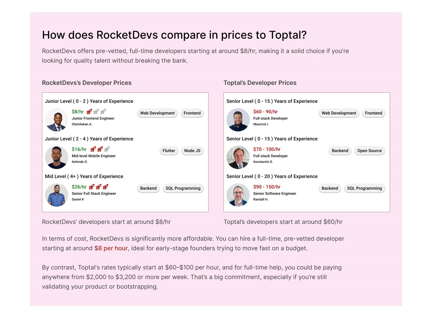
Pricing Comparison
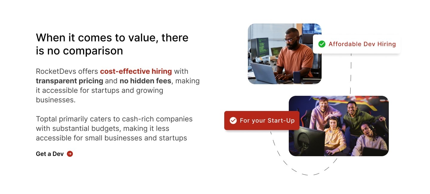
I designed the pricing section to make cost differences easy to understand at a glance. Instead of simply listing rates, it combines pricing with context around value, helping users compare platforms and make faster, more informed decisions.
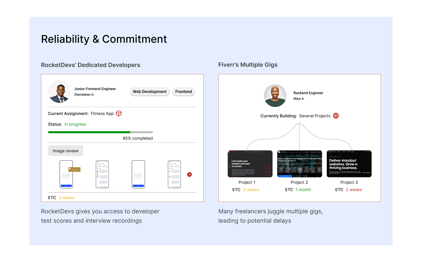
Reliability & Commitment
Hiring a developer is a long-term investment, so I designed this section to help users assess each platform's reliability beyond the initial hire. The comparison highlights factors such as developer commitment, consistency, and long-term collaboration, giving users a clearer understanding of what they can expect after onboarding.
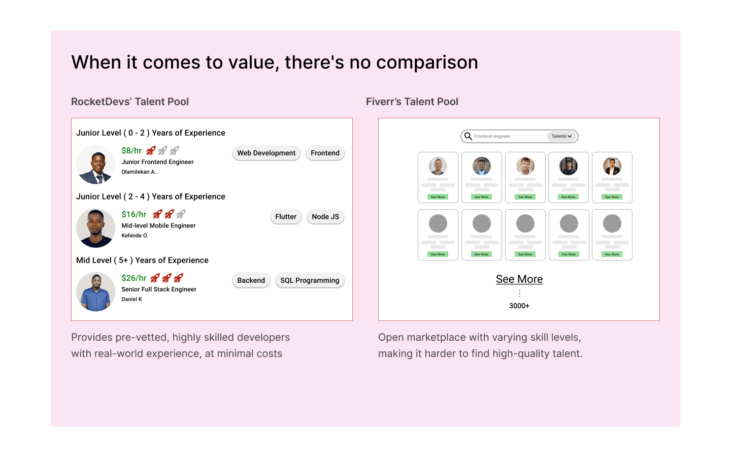
Talent Quality Comparison
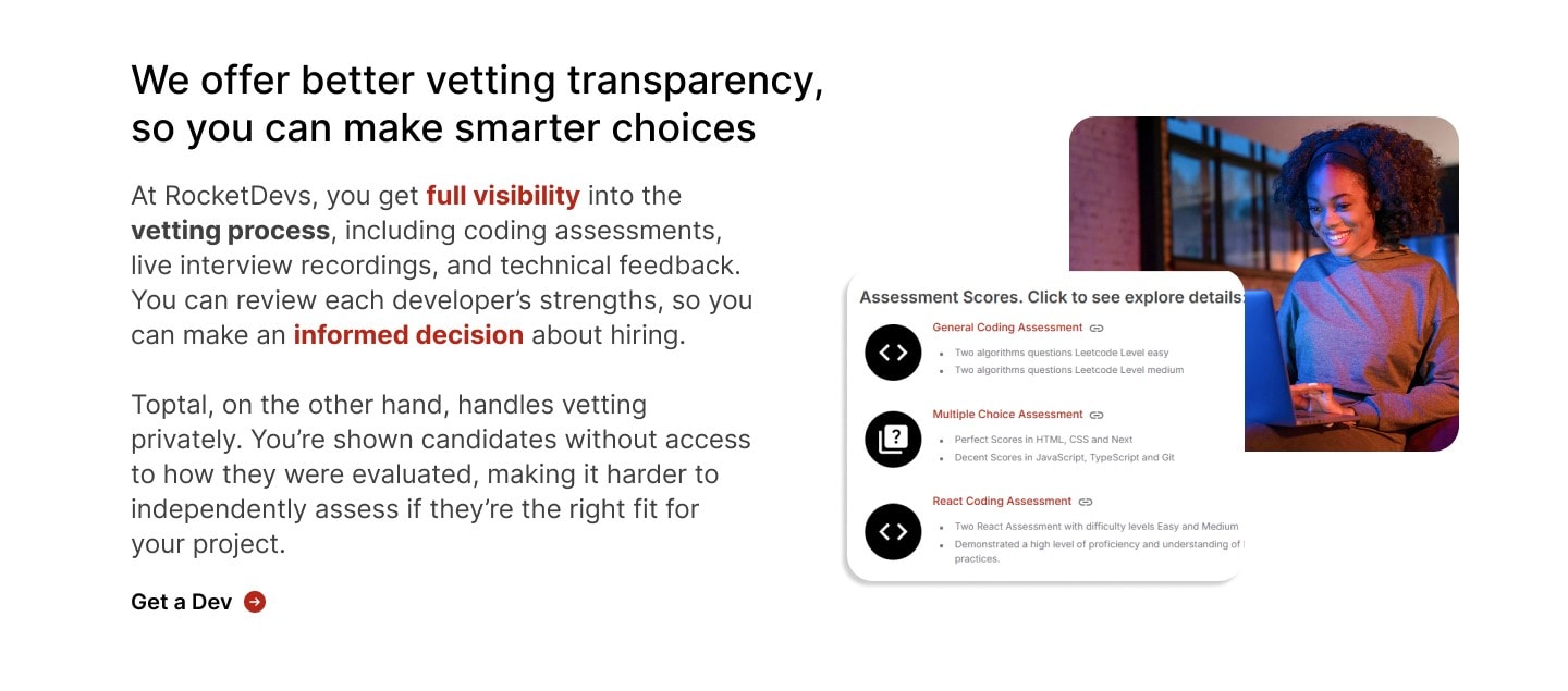
Finding the right developer isn't just about availability, it's about confidence in the quality of talent. I designed this section to compare the strength of each platform's talent pool, helping users quickly understand the differences in vetting standards, developer experience, and hiring reliability.
Why RocketDevs?
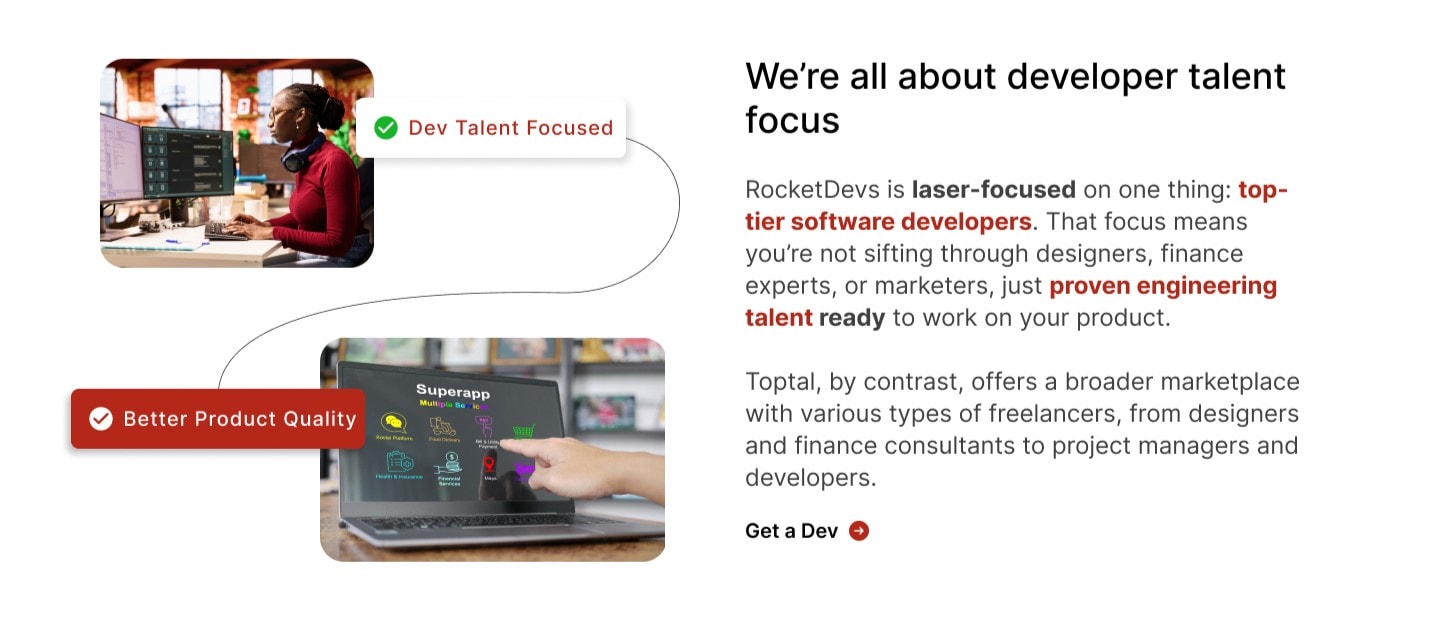
After presenting an objective comparison, the page shifts focus to RocketDevs' strengths. This section highlights the platform's unique value proposition through concise content supported by icons and visual cards, making it easier for users to understand what differentiates RocketDevs from competing platforms.
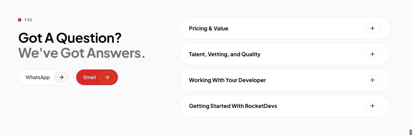
Frequently Asked Questions
By the time users reach this point, they typically have a few remaining questions before making a decision. The FAQ section addresses common concerns around pricing, hiring timelines, developer quality, contracts, and support, reducing friction and minimizing the need to leave the page in search of additional information.
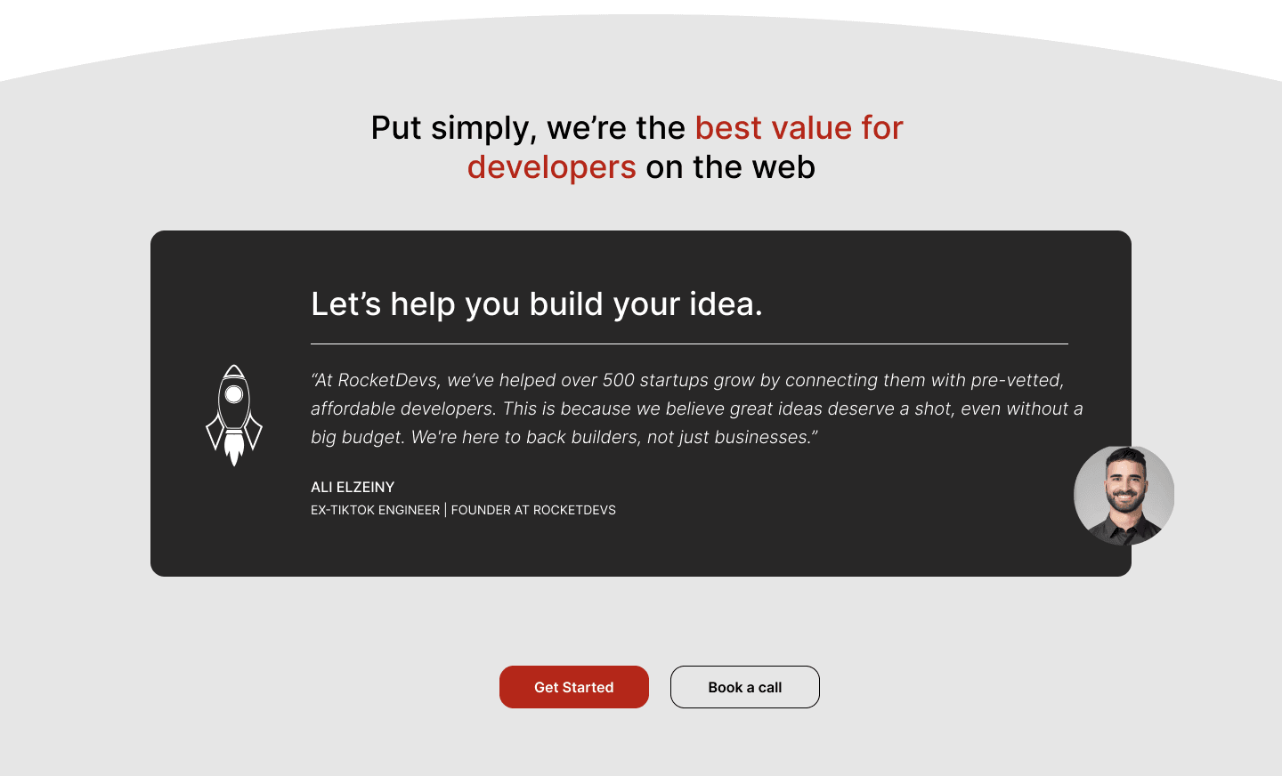
Final Call to Action
The final section brings the entire experience together with a clear, action-oriented call to action. After educating users, answering objections, and building trust, the page encourages visitors to take the next step by booking a call or beginning the hiring process.
Rather than introducing new information, this section reinforces the platform's core value proposition and provides a simple path to conversion.
Outcome
7
reusable page sections designed
3
competitor pages shipped
~1 yr
in production before the rebrand
The project resulted in a scalable competitor page framework that could be reused across multiple landing pages while maintaining a consistent user experience and brand identity. By organizing complex comparisons into clear, easy-to-scan sections, the pages made it easier for prospective customers to evaluate RocketDevs against competing platforms and make more informed hiring decisions. The reusable design system also streamlined future page creation, reducing design effort while supporting RocketDevs' SEO and lead generation strategy. After handoff, the marketing team continued building on the framework for roughly a year, until RocketDevs went through a rebrand.
Key Design Decisions
A reusable framework over bespoke pages
I could have designed each competitor page completely differently to sharpen the argument against each platform, but that would have made the system harder to maintain and scale. I prioritised consistency and repeatability, accepting some visual similarity between pages in exchange for a framework that could be reused efficiently.
What stayed fixed, what varied
The core structure, comparison logic, visual hierarchy, and conversion points stayed consistent across all three pages. The content inside those sections changed per competitor, covering pricing, talent pool, reliability, and value proposition, so each comparison stays relevant while the experience remains familiar.