


Trusty
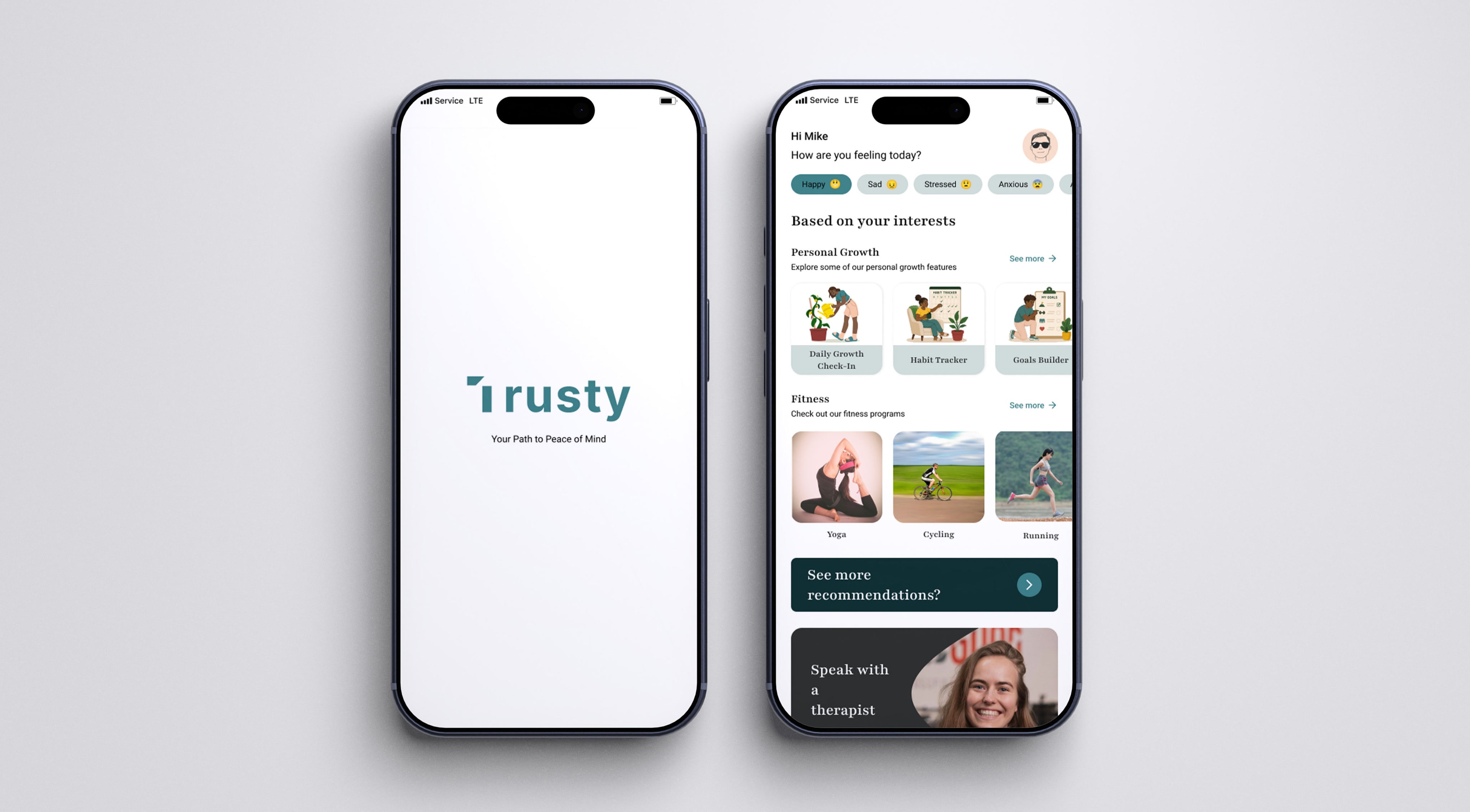
Product DesignExperience DesignTrusty is a mental wellness platform designed to make emotional wellbeing feel more approachable, supportive, and accessible. The platform combines therapy, fitness, mindfulness, and personal growth tools into a single experience that helps users build healthier routines and improve their overall wellbeing.
- Role
Product Designer
- Scope
- Product ResearchUX DesignUI DesignUser FlowsWireframingPrototypingDesign SystemInteraction Design
- Problem
Many mental wellness platforms feel overwhelming and fragmented, making it hard for users to find support and stay consistent across different tools like therapy, fitness, and mindfulness.
- Solution
Designed Trusty, a mental wellness platform that combines therapy, mindfulness, fitness, and habit-building into one calm, connected experience that helps users focus on their wellbeing without feeling overwhelmed.
Research & Discovery
The project began with researching existing mental health and wellness platforms to understand common usability and emotional friction points.
I analyzed onboarding experiences, therapist discovery flows, and overall navigation while exploring user feedback to identify recurring frustrations around complexity, lack of personalization, and overwhelming interfaces.
These insights helped define opportunities to create a calmer, more guided experience and informed the direction of the product moving forward.
User Flow Mapping
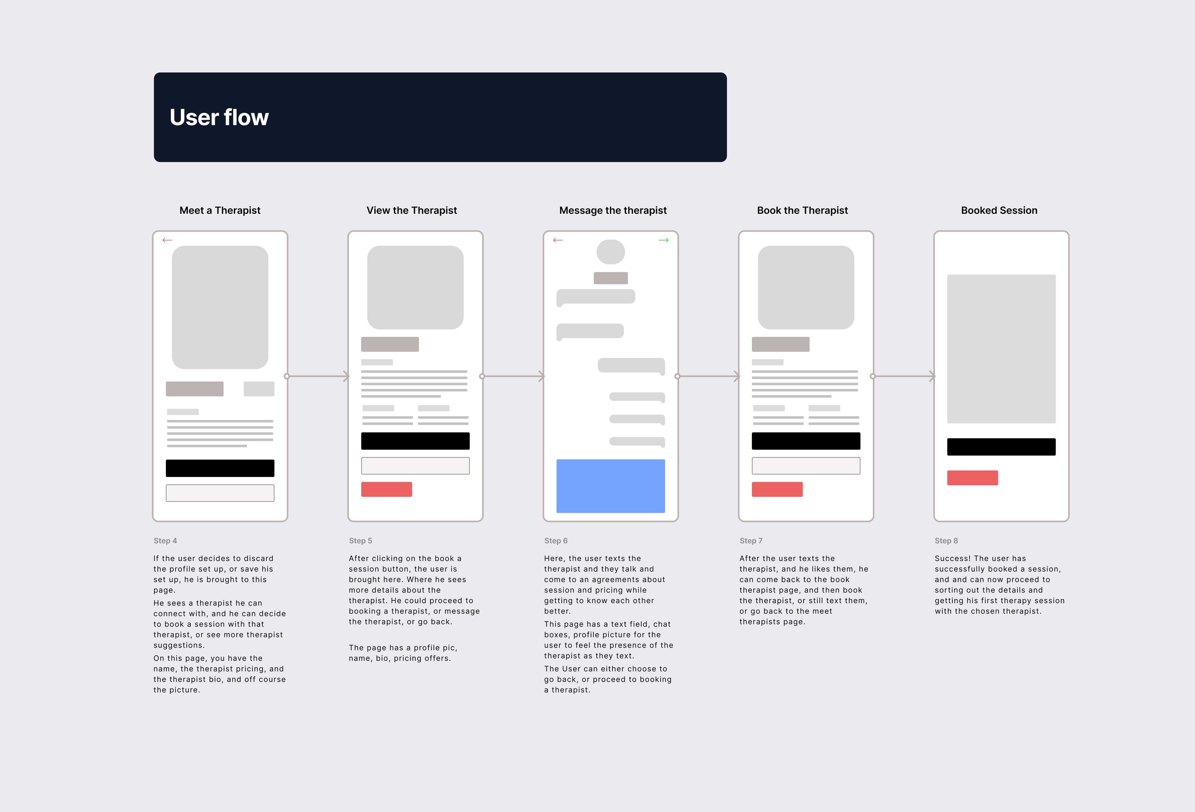
After identifying key friction points, I mapped out the core user journeys to make the experience feel more guided and less overwhelming.
A major focus was simplifying onboarding through smaller, more conversational steps that reduced cognitive load. I also designed therapist discovery to feel more personal and intuitive, with clear categories, profiles, and booking actions.
To create a seamless experience, features like booking, messaging, and session management were connected through a simple and consistent flow.
Wireframing
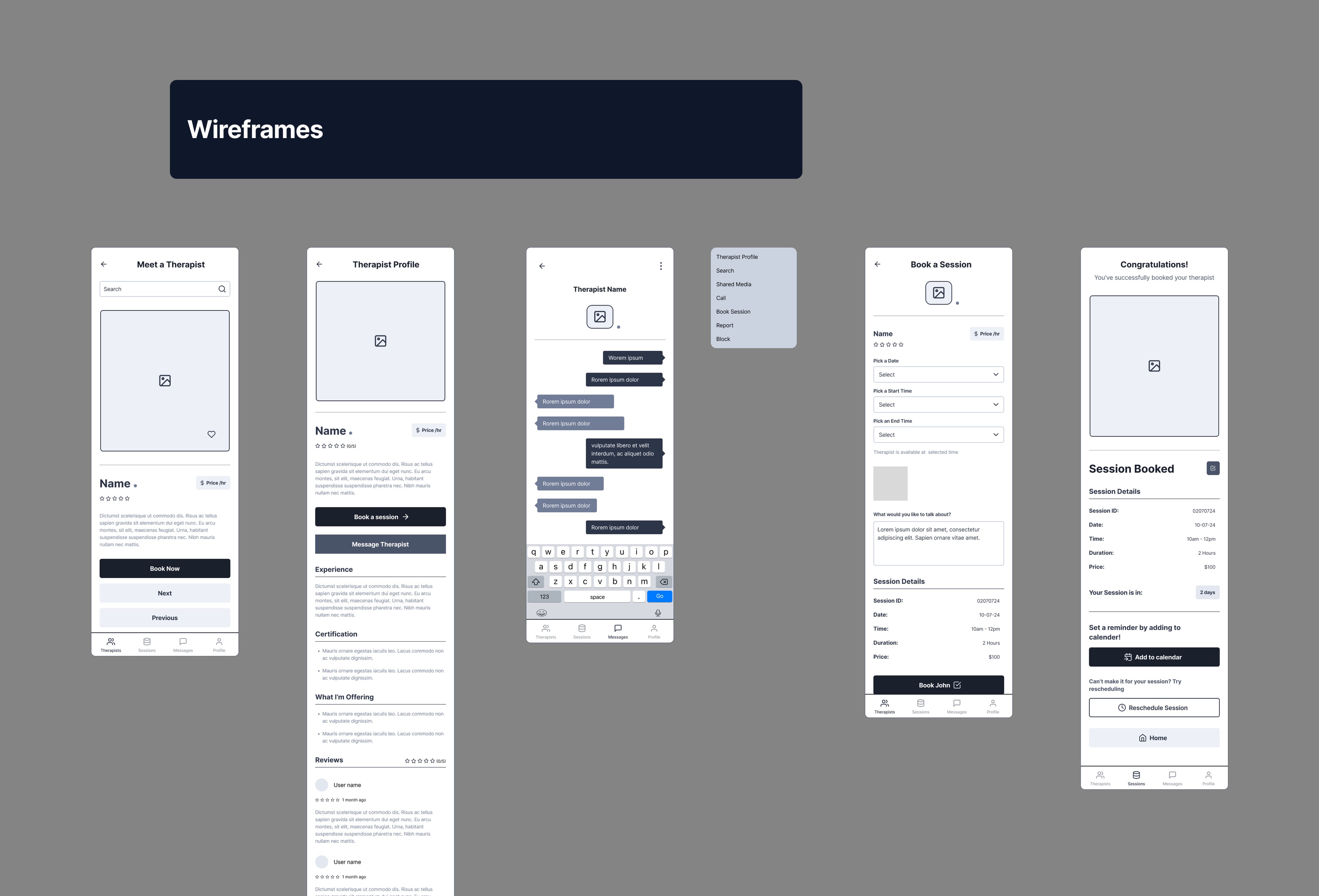
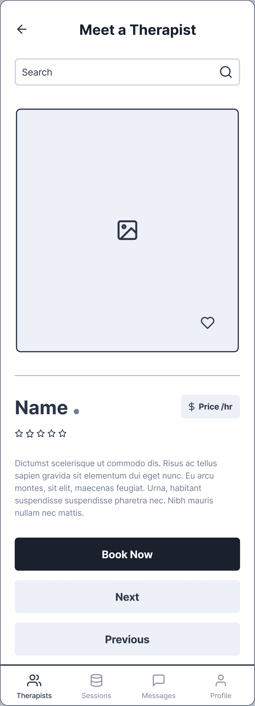
Low-fidelity wireframes were created for key flows including finding a therapist, viewing therapist details, in-app chat, user profile, booking a session, and the booking confirmation screen.
This stage focused on structuring each flow clearly and ensuring users could move smoothly from discovery to booking without confusion or unnecessary steps.
It helped define hierarchy, improve navigation between screens, and refine how each part of the therapy journey connects within the app.
Challenges
The main challenge was creating an experience that felt emotionally safe without becoming overly clinical or overwhelming. Early concepts included too much information, making onboarding feel more like a form than a conversation.
I simplified the flow into smaller steps, reduced unnecessary inputs, and refined the hierarchy to create a calmer, more welcoming experience without compromising usability.
Key Design Decisions
One product, not five
Wellbeing isn't one-dimensional. Someone might need therapy at one point, and mindfulness, fitness, habit building or personal growth at another. Bringing these areas together created a more holistic experience than forcing people to manage their wellbeing across separate apps. The main risk was overload, five wellness areas in one product could easily feel like a collection of unrelated features, which is why information architecture and navigation carried so much of the work.
Defer personalisation rather than front-load it
Early onboarding concepts tried to introduce too much of the product upfront. I reduced unnecessary questions and deferred deeper personalisation until users had entered the core experience. The reasoning was simple: not every decision needs to be made before someone has experienced the product. Onboarding carries only what's needed to understand it and get started, and secondary preferences come later.
A journey, not a menu
I treated the five domains as parts of one broader wellness experience rather than five separate products, so navigation leads with the user's overall wellbeing journey and keeps individual areas accessible without competing equally for attention. We deliberately avoided a dashboard filled with five large feature blocks, that would have made Trusty feel like a menu rather than an experience. Hierarchy, progressive discovery and consistent navigation patterns did that work instead.
Warm, but not cheerful or clinical
I aimed for a tone that felt warm, supportive and human, without tipping into relentless positivity or clinical distance. I avoided medical terminology where it wasn't necessary, excessive motivational language, and interfaces that talk down to the user. Softer layouts, generous spacing, subtle colour and approachable typography create emotional comfort while keeping the clarity and credibility a health-related product needs.
Scope & Delivery
5
wellness experiences connected
Visual system
typography, spacing, components, interactions
I designed the end-to-end mobile experience, onboarding, the core wellness journeys, navigation, and habit and activity tracking, alongside a reusable visual system covering typography, spacing, components and interaction patterns. The work focused on simplifying onboarding and connecting therapy, mindfulness, fitness, habit building and personal growth into one coherent experience.
Visual Design
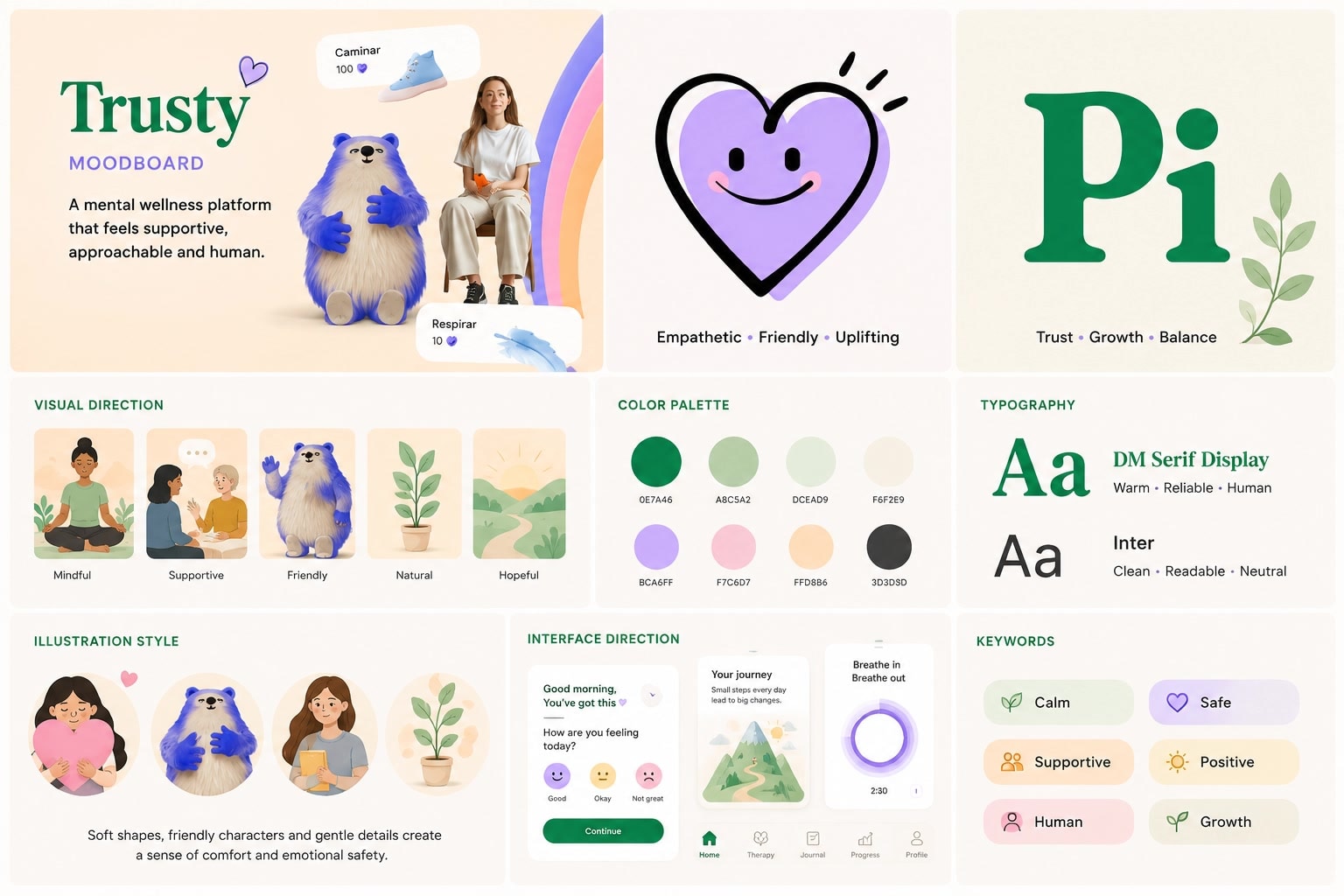
Trusty had to feel warm without being saccharine, and credible without being clinical. Most of that work happened in the type and the palette rather than in decoration.
Headings are set in a high-contrast serif and body copy in a neutral sans. The serif carries the warmth and gives the product a voice; the sans keeps the dense screens readable, whether that is session details, therapist credentials or booking forms. Pairing them lets one face do the emotional work and the other the informational work, instead of asking a single family to do both.
A muted teal carries every primary action: Get Started, Book a Session, Watch session recording, and every link. It is the only saturated colour with a job, so wherever it appears something happens. Green is reserved for rates and positive values and never used decoratively, which keeps it readable as information rather than mood. Emphasis elsewhere is carried by near-black cards rather than by more colour, so the palette stays calm while still having a loud register.
Onboarding
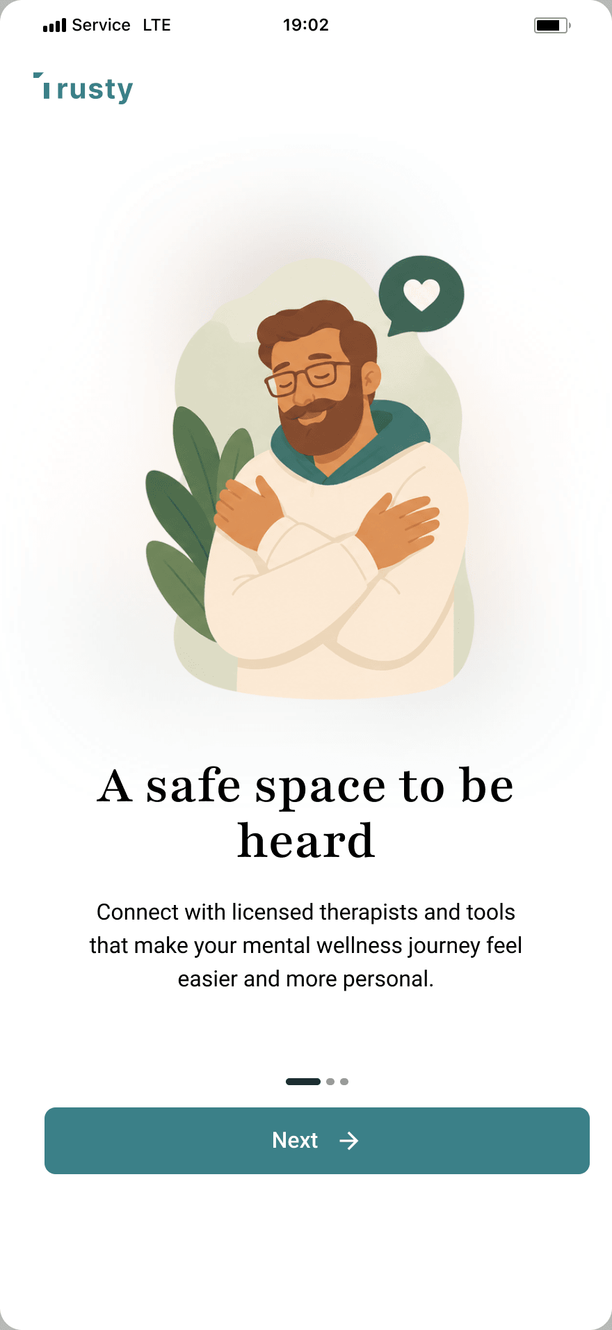
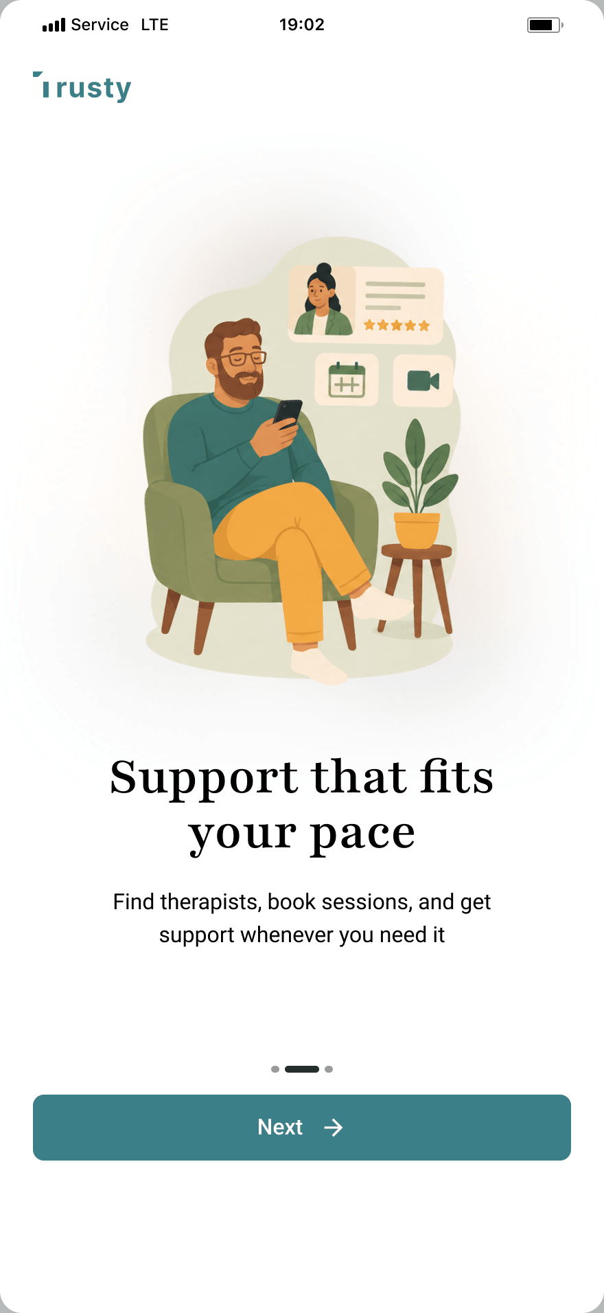
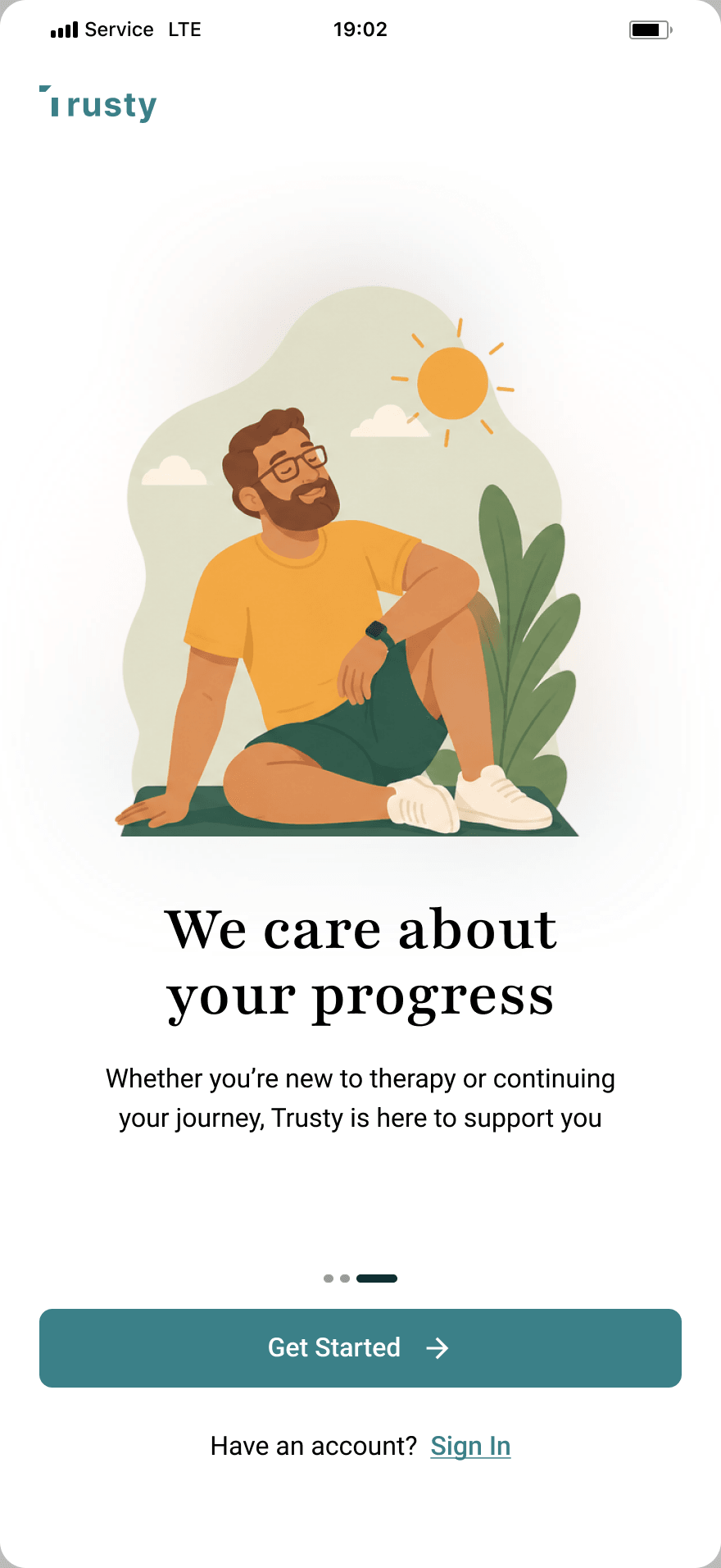
The onboarding was designed to feel calm, welcoming, and easy to navigate from the first interaction.
I used generous spacing, soft visual elements, clean typography, and subtle colors to reduce visual tension. Each screen introduces only what users need at that moment, creating a simple and supportive flow.
Profile Setup
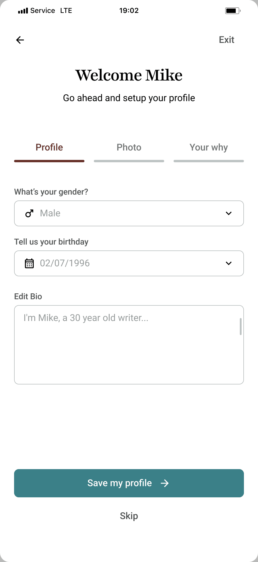
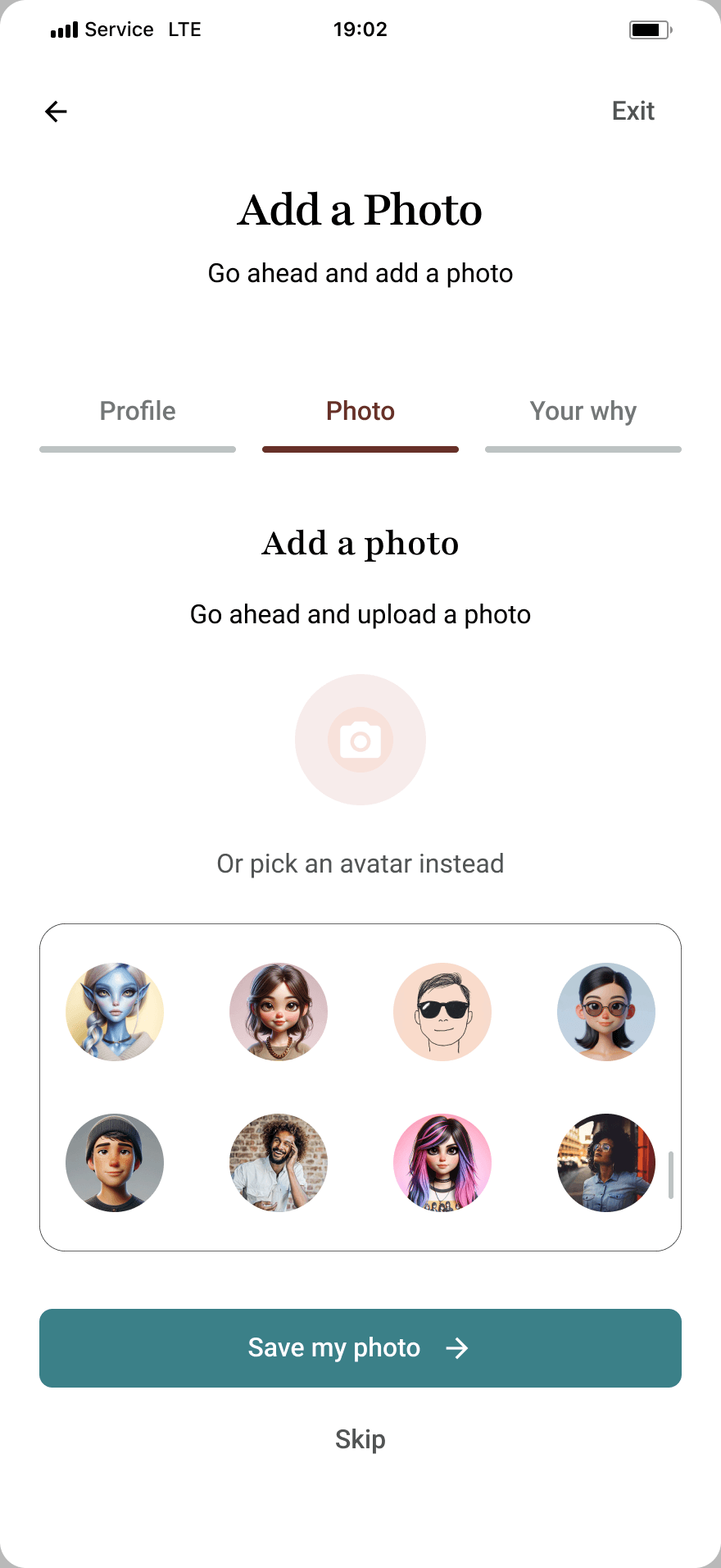
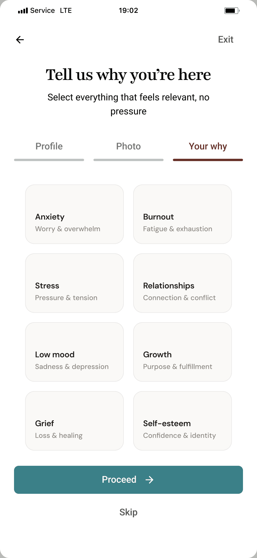
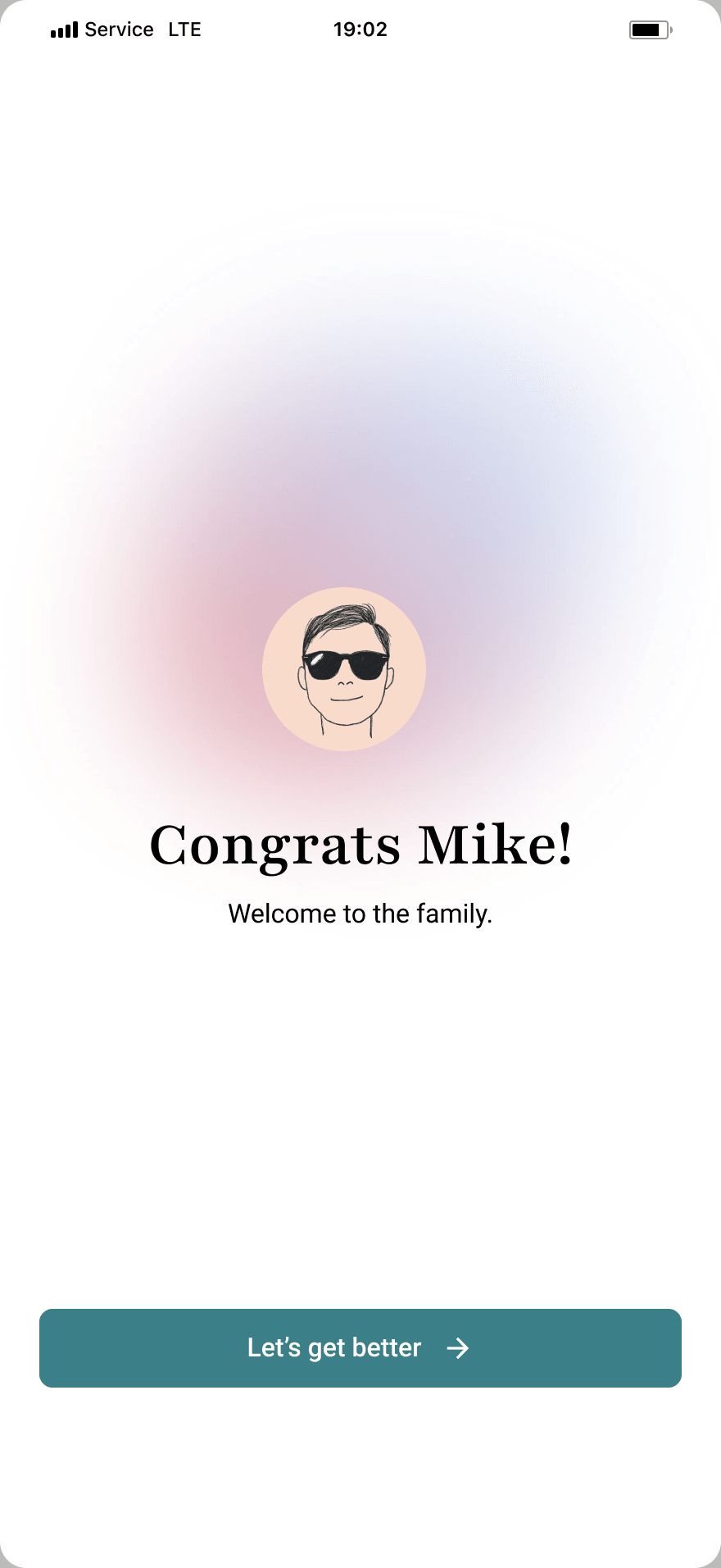
Signing up is only the first half of getting started. The screens that follow collect just enough to make the product feel like the user's own: a name, a photo, and the areas of wellbeing they want to focus on, then close on a confirmation rather than another form.
This is where deferring personalisation shows up most clearly. Each step asks for one thing at a time, so setup reads as a short sequence rather than a long registration, and the deeper preferences wait until someone has actually seen the product.
Core Screens
The core screens were designed to support different areas of wellness including therapy discovery, habit tracking, fitness, personal growth, and daily wellbeing activities.
Each screen was designed with clarity and emotional comfort in mind, using consistent spacing, clean typography, and minimal visual noise to create a more supportive experience throughout the app.
Home
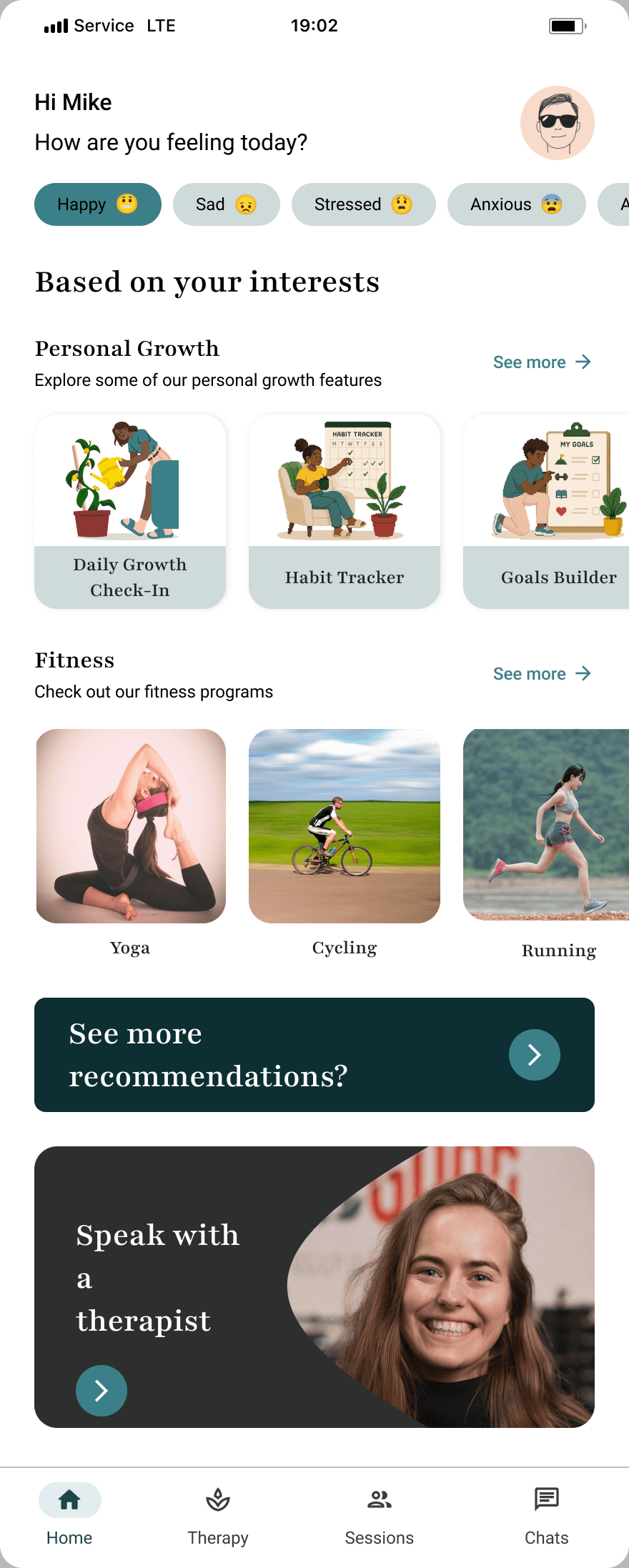
The home screen opens with a question rather than a dashboard. The mood check-in sits above everything else, and what appears below changes with the answer, so the first thing the product does is ask how someone is rather than tell them what to do.
Content underneath is grouped by the areas chosen during setup and laid out as horizontal rails rather than equal-weight feature blocks. Five large tiles would have made Trusty read as a menu of five products; rails let one area lead without the others disappearing.
The two dark cards at the bottom carry the only strong calls to action on the screen, see more recommendations and speak with a therapist, so there is one obvious place to land when someone wants to act.
Therapy
The wireframe treated this as a directory. A search field, then a flat list of therapists, with the assumption that everyone arriving here was starting from scratch.
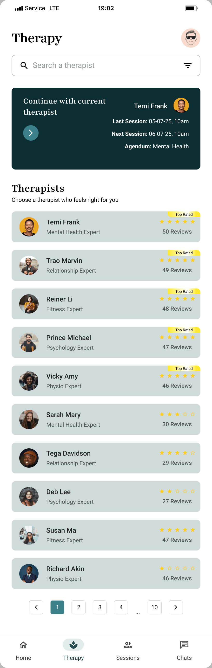
The final design leads with continuity instead. If someone already has a therapist, the top of the screen is that existing relationship, showing the last session, the next one and the agenda, and browsing moves below it. Most people opening this screen are returning, not choosing for the first time.
The list itself gained what people actually decide on: specialism, rating, and how many reviews it rests on. Search and filters stayed, but as tools for someone who knows what they want rather than the default state.
Filters
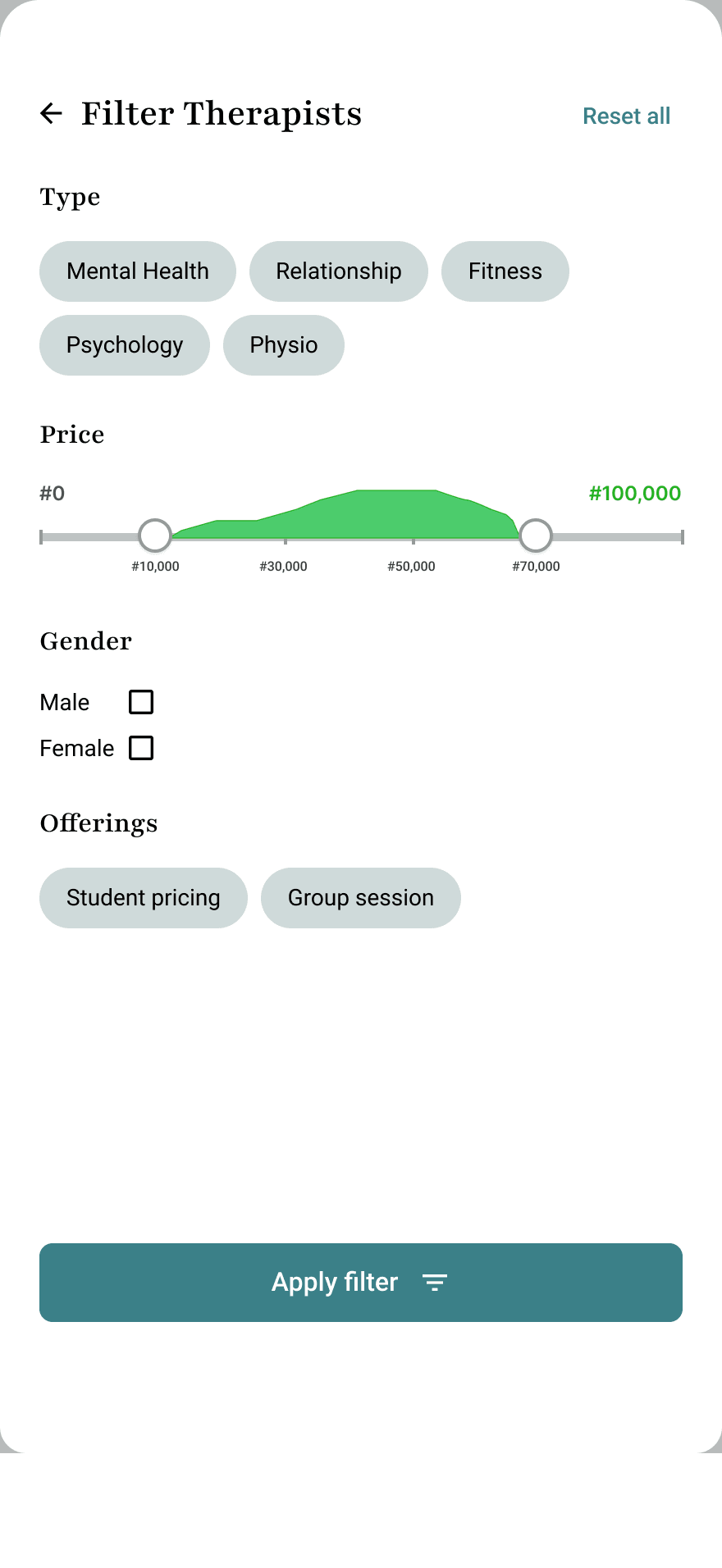
Search assumes someone already knows what they are looking for. Filters are for everyone else, and they carry the criteria people actually choose a therapist on rather than a generic keyword box.
Keeping them behind a control rather than on the page meant the therapy screen could stay calm by default, and still get out of the way quickly for someone with a specific need.
Sessions
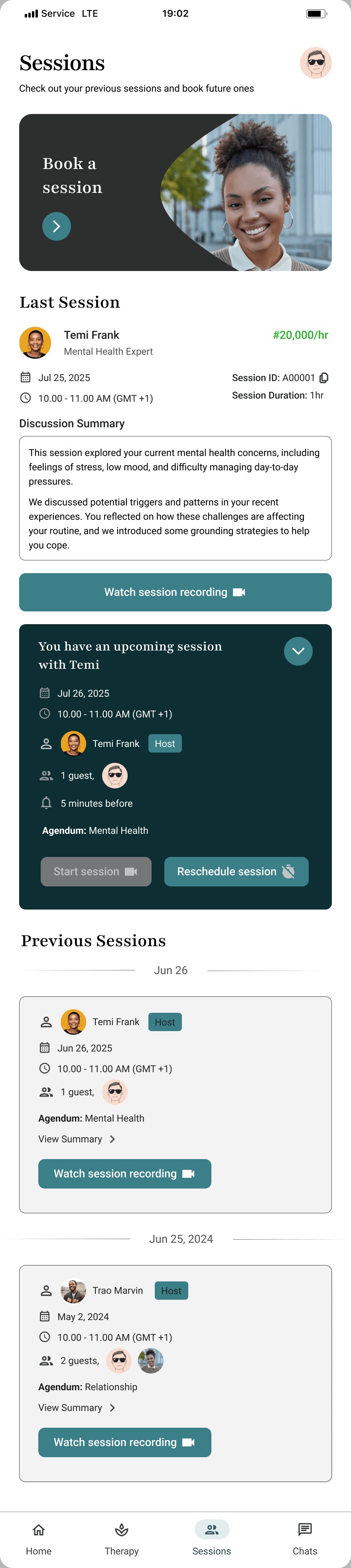
Sessions answers three questions in one place: what happened last time, what is coming, and how to book more.
The last session leads with a written summary rather than a recording, and keeps the recording one tap away. An upcoming session is a single dark card that expands into its detail, showing host, guests, reminder and agenda, so the screen stays quiet until someone needs it. Previous sessions run underneath, grouped by date.
Therapist Profile
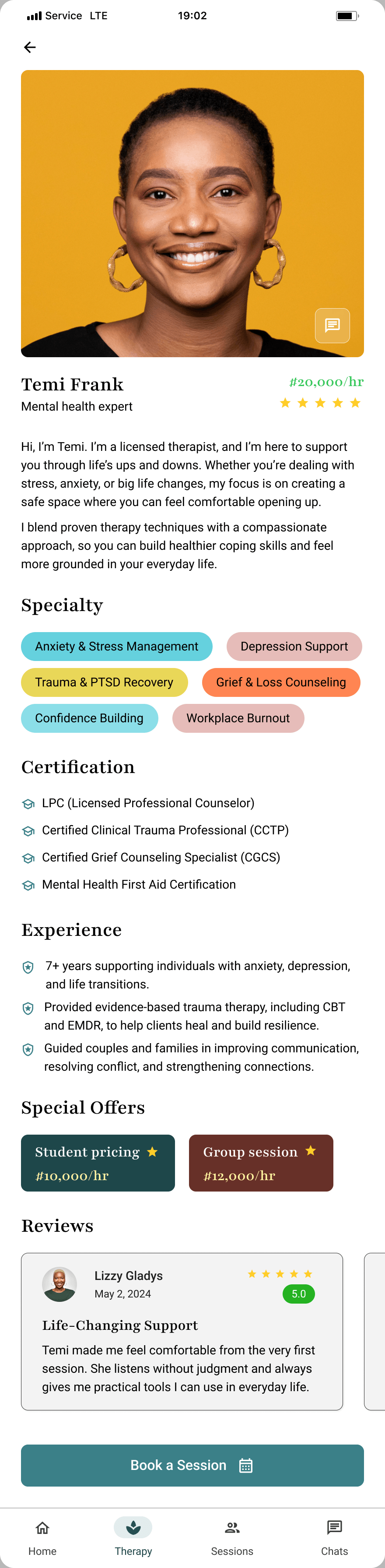
Choosing a therapist is a high-stakes decision made by a stranger reading a page. The question this screen has to answer is not what someone offers, but whether they can be trusted with something difficult, and that changed the order of everything on it.
The wireframe opened with the booking action and put the reasons to book underneath. The final design inverts that: rate and rating together at the top, then the therapist's own words, then the things that can be checked independently, specialisms, certifications, years of experience, and reviews from people who have had sessions. Booking comes last, once the case has been made rather than before it.
Structuring it that way also kept the page factual. Nothing here argues that a therapist is good. It sets out what they are qualified in and what other people said, and leaves the reader to draw the conclusion.

Booking a Session
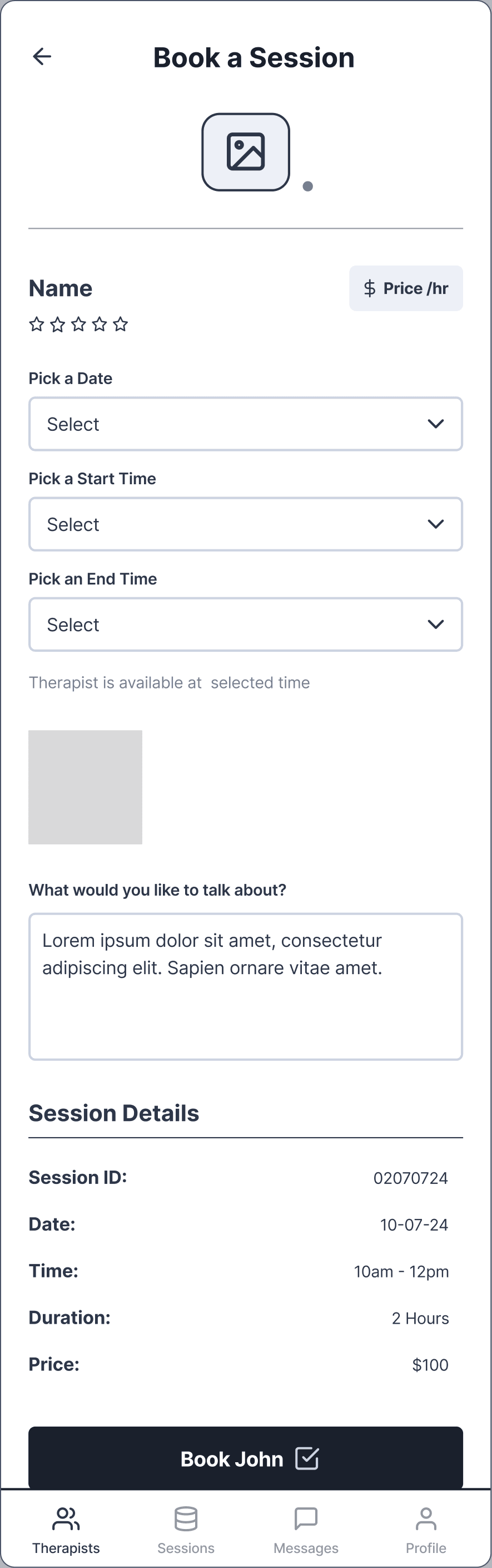
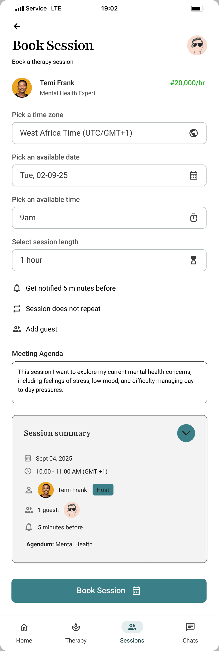
The wireframe stacked every booking decision into one dense panel of dropdowns. It worked, but it read as paperwork.
The final design breaks the same decisions into four separate single-purpose rows, timezone, date, time and length, each already filled in with a sensible default so the common case is confirmation rather than entry.
The meeting agenda is the only free-text field and it moved to the end, after the mechanical decisions are done, when someone has the attention to write something considered.
Chats
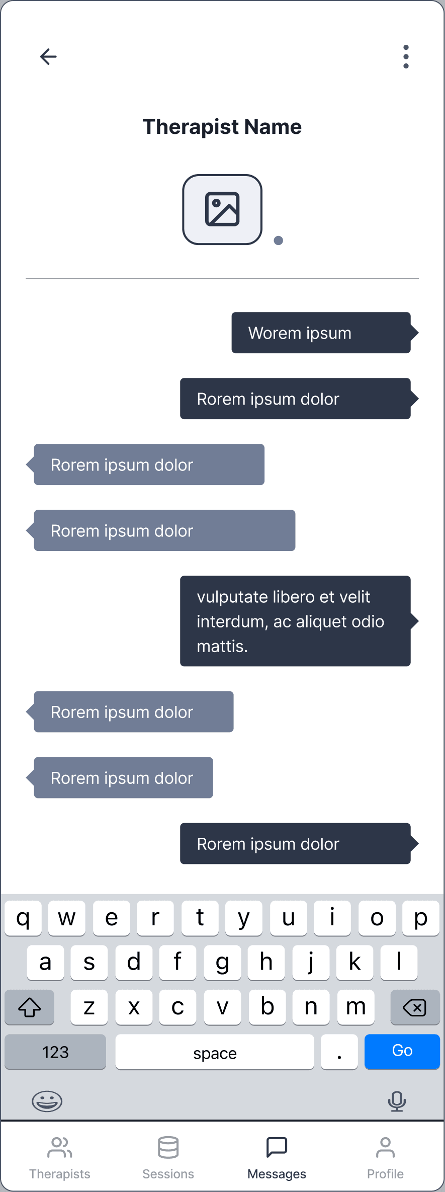
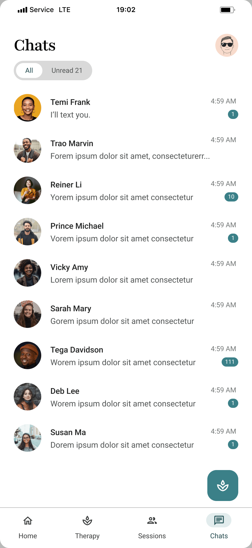
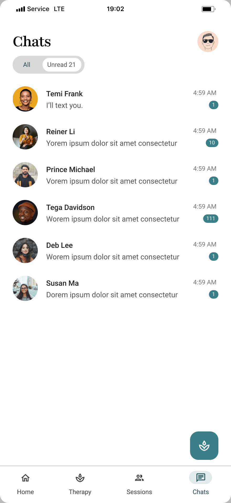
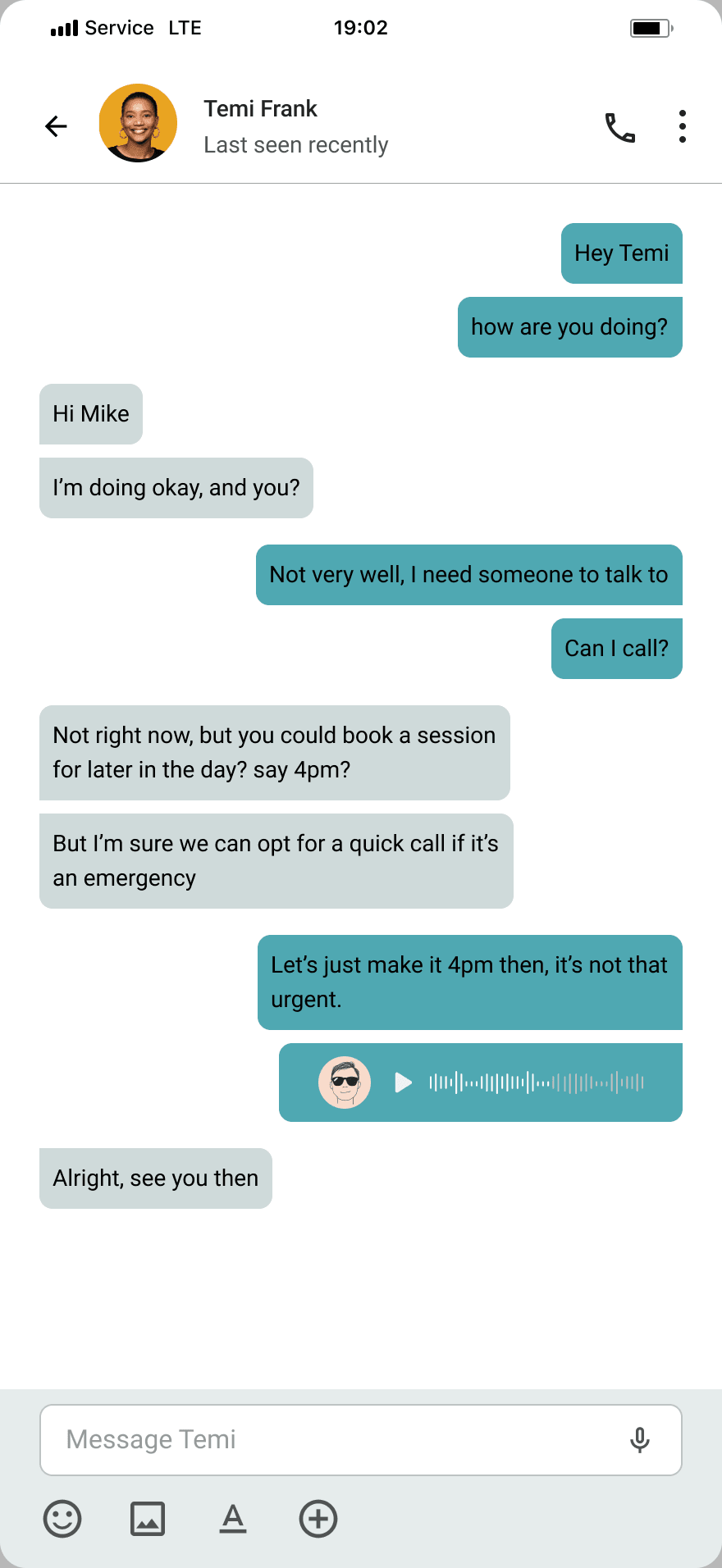
The wireframe put messaging inside the therapist profile, reachable only once you had opened someone. The final design promotes it to the bottom navigation alongside Home, Therapy and Sessions, because a conversation already underway is something people return to directly rather than navigate back into.
That is also what keeps the rest of the product from growing sideways. Four destinations at the top level meant everything else could nest underneath without the navigation competing with the content.
The list itself is deliberately plain, just avatar, name, preview and unread count, because it is somewhere people pass through on the way to a conversation, not somewhere to spend time.
Key Takeaways
This project reinforced the importance of designing for both functional and emotional needs. Small decisions around spacing, tone and hierarchy had a noticeable effect on how supportive the experience felt, and they were rarely separable from the usability ones.
The hardest part was scope. Five wellness areas in one product is an information architecture problem before it is a visual one, and most of what makes Trusty feel calm happens in navigation and hierarchy rather than in the interface itself. Deciding what not to surface mattered more than deciding what to show.
Wireframing the therapy journey early is what made that possible. The arguments about order, what leads, what waits, and what earns a place in the bottom navigation, were settled in low fidelity, so the visual work could concentrate on tone instead of relitigating structure.